Neutral, professional, near-perfect. Almost boring, and meant to be — it carries the body copy and lets everything else lead.
Brand Guidelines
Searching for the Essence of Beauty.
Punctum’s identity is built to frame the work, not compete with it — deliberately quiet, typography-led, with colour used only where it counts. Its one exception is the wordmark: the detail that breaks the order and stays with you.
Explore rules ↓

01 Approach
Space for the image. A point of difference in the type.
Punctum makes images — and the identity exists to serve them. It works like a gallery wall: quiet, deliberate, and restrained enough to give the photography room to breathe. It should never change how the work is perceived, only frame it, stage it, and then step back.
The name is Roland Barthes’ term from “Camera Lucida.” He paired the studium — the ordered, cultural reading of a photograph — with the punctum: the small, piercing detail that breaks through and stays with you. Punctum’s typography makes the same move.
Typography is the essence of the identity, carried by strong, restrained colour accents. Master the type and the colour, and the rest falls into place.
Organic, warm, a little clumsy and human. The detail that disrupts the order — Maroni breaks Saans as the punctum breaks the studium.
02 Logo
Logotype
Use the full Punctum wordmark wherever there is enough space for it to remain legible and confident.
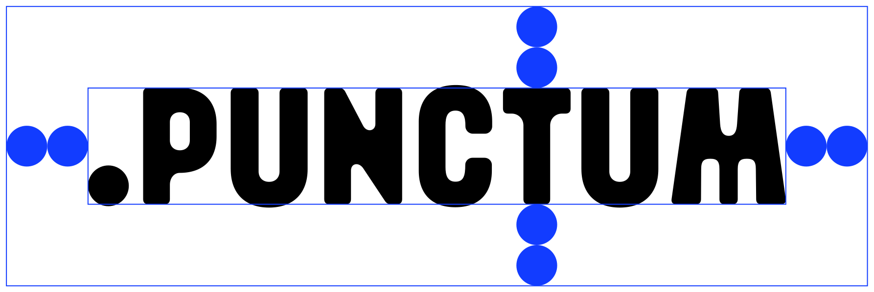
Logotype clear space
Use the clear-space construction as the reference for minimum spacing around the full wordmark.
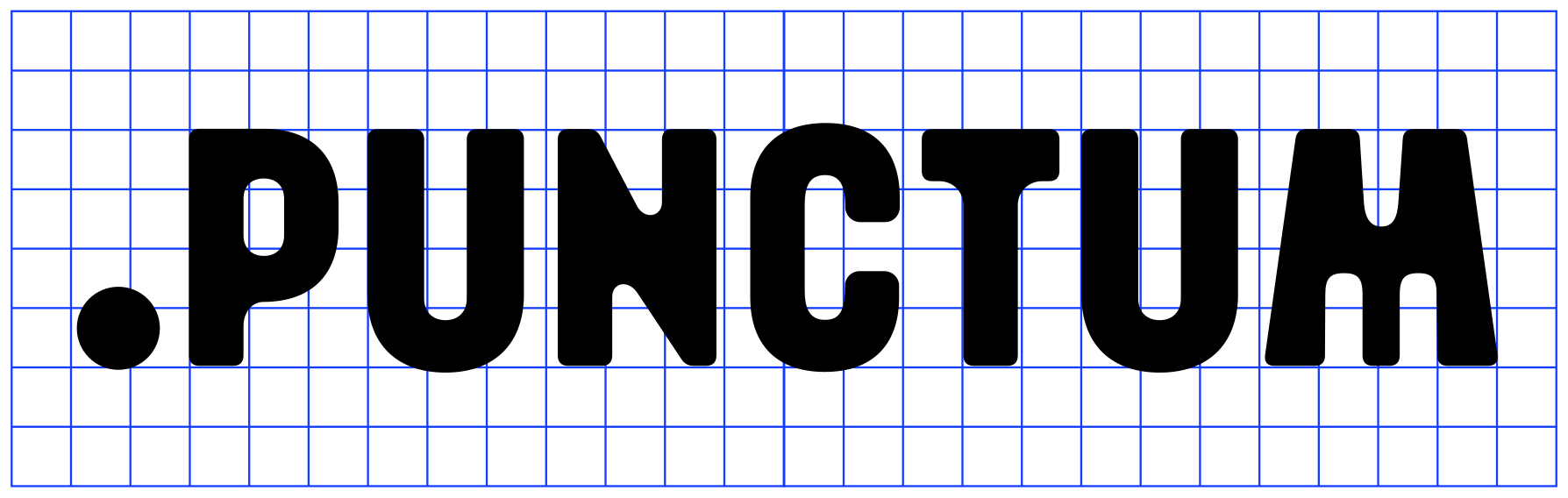
Logotype anatomy
The logotype is built on a bold, compact structure. Preserve its proportions and internal rhythm.
Brand mark
Use the compact mark for avatars, favicons, app icons, and small-scale placements where the full logotype is not practical.

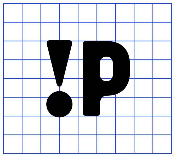
Brand mark anatomy
The brand mark uses the same bold construction as the full logotype and should remain visually consistent across compact applications.
Dos and don’ts
Keep the logo system consistent. Do not redraw, recolour, stretch, or approximate the assets.
Use strong contrast
Use black on white or Punctum Bone; white on black and dark imagery.
Do not distort
Never stretch, squash, rotate, outline, or add effects.

Do not change colour
Only use the approved black and white logo artwork.
.PUNCTUM
Do not change font
Do not reset, redraw, or replace the logotype with typed text.
03 Colour
Punctum Black
Primary background, core typography, logo on light surfaces.
Punctum Bone
Soft panels, warm neutral backgrounds, logo staging.
Punctum Orange
Primary accent, labels, emphasis, and active moments.
Punctum Blue
Rare secondary accent for interaction, support, and utility.
Punctum Graphite
Secondary neutral for dividers, captions, and quiet structure.
Colour hierarchy
Black and Bone carry the system. Graphite supports them; Orange and Blue appear only as accents — the scale shows roughly how much of each to use.
Colour usage
Use pairings that feel deliberate, high contrast, and simple. Keep accent combinations controlled.
Colour misuse
Avoid pairings that weaken contrast, overuse accents, or make the palette feel decorative rather than deliberate.
Do not overuse accentsOrange and Blue should not dominate the same composition.
Do not reduce contrastKeep enough separation for legibility and impact.
Do not pair Blue with GraphiteThis pairing feels too cold and low-impact for the system.
Do not flatten hierarchyGraphite supports Black; it should not compete with it.
04 Typography
Maroni — display only
The wounding, personally touching detail creating a direct relationship.
Use forHero statements and large display headlines only
CaseUppercase or sentence case
Letter spacing-2px
Saans — text, sections, and UI
The cultural, linguistic, and political interpretation of a photograph.
Use forSection headers, body copy, UI, captions, navigation
WeightsRegular, Medium, Bold, Heavy
Letter spacing-2px
“Punctum – a detail in an image which captures a viewer’s attention and holds emotional significance.”
05 Brand messaging
The message and the mark, as one.
Punctum’s logotype invites brand communication to lock up directly with it. The dot acts as a natural divider — it marks where the message ends and the logo begins, holding the whole thing together as one compact, legible unit. Because it reads as a single element, the message and the dot are never set in a separate colour.



06 Applications
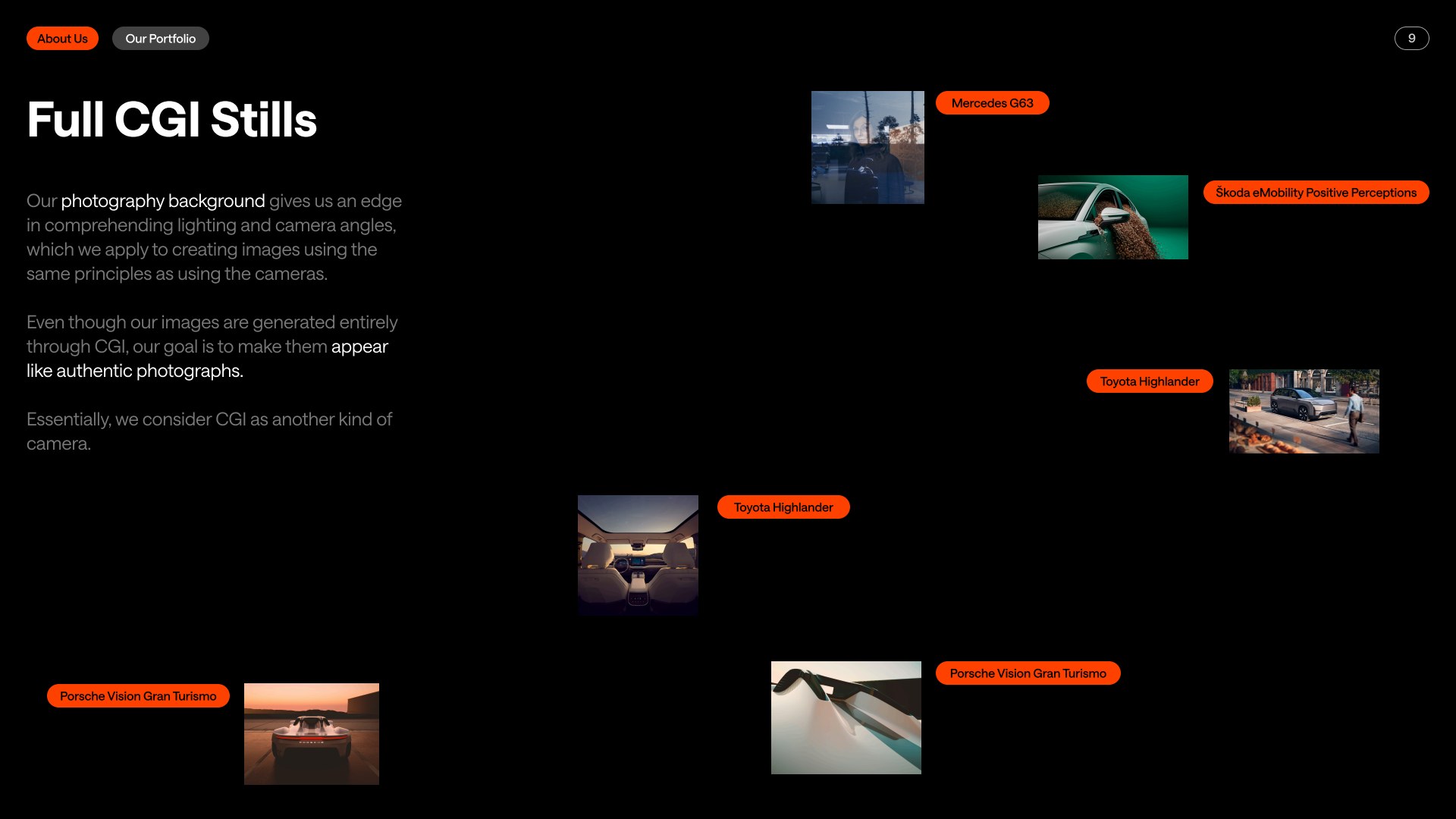
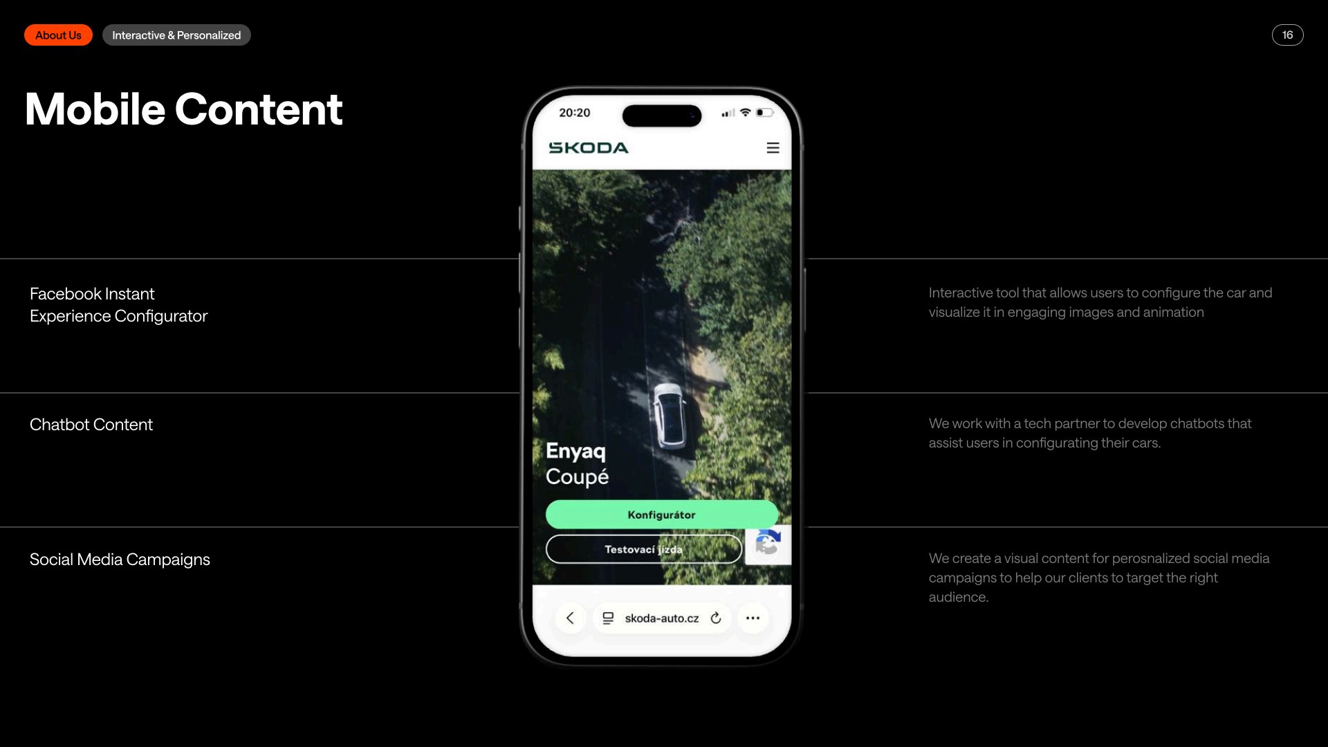
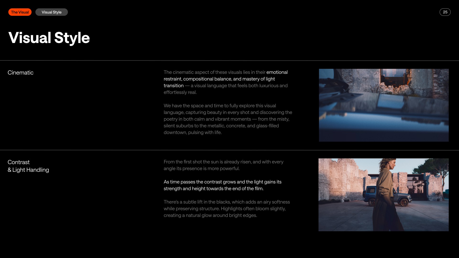
Presentation
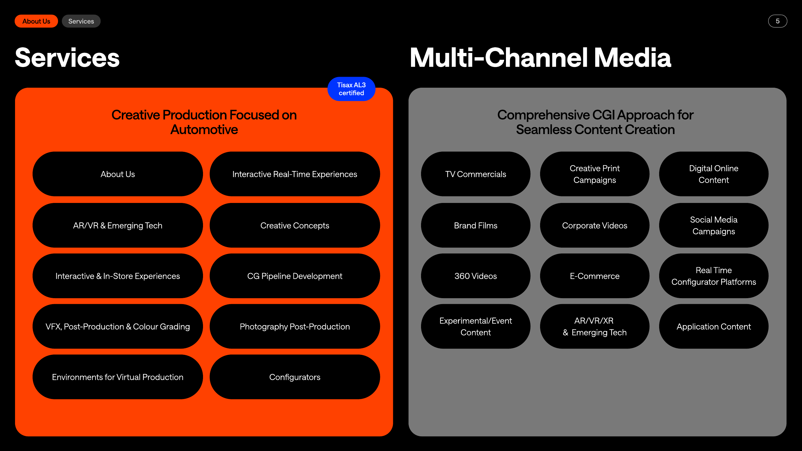
Use the deck as the primary expression of the system.
Build presentations around black foundations, precise spacing, strong photographic moments, and bold utility accents.


Social
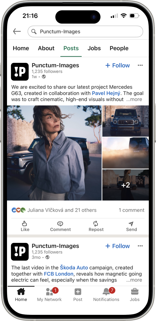
Make the icon and imagery instantly recognisable.
Use the white mark on black as the compact social avatar. Pair it with tight crops and quiet, well-spaced imagery in the feed.
Brand details
Use real interface components, not placeholders.
Labels, dividers, and calls to action should be simple, direct, and visibly rooted in the overall system.
Label
Brand GuidelinesUse the orange pill as a compact category tag, slide marker, or small metadata cue.
Divider
Case study / Mercedes G63
A clean divider keeps structure visible without demanding attention.
CTA
Download the assets ↓
Calls to action should be rounded, direct, and high contrast.
Business card
Photographic on one side, practical on the other.
Use the front for a strong photographic statement and the back for clean contact information, high contrast, and generous spacing.

07 Downloads
Everything needed to use the brand correctly.
Download the approved logo files and source decks. The licensed font files are included in this package — keep them with it.